Sunday, May 27, 2012

Just A Check for $1.00

Yesterday, I took the time to go through a pile of unopened junk mail that had been piling up on the table in my entryway. I was on a cleaning frenzy and felt a slight annoyance as I started flipping through each unopened envelope.  How many trees are wasted each year so that this junk mail can be delivered to clutter up my home?  I know I receive my fair share of it. In the pile, was the typical credit card offers, AARP membership information (now that I'm 50), and other assortments of the same old same old. I sometimes don't even open them because it isn't worth the risk of getting a paper cut,  but one envelope in the stack caught my eye. I had never seen this company send me anything before and so I immediately assumed that my contact information had been sold on a list recently.

I decided to rip open the flap to see what this was all about and was shocked to find a check for $1.00 made out to me. I stared at the information, trying to understand what this simple piece of paper really represented. Slowly, the full realization began to come into focus. The note section on the check stated "Fineartamerica.com payment" and of course it was made out to me. After a few moments passed, I realized that I must have sold a note card on the Fine Art America website and this was my profit from that sale.

I've seen many business that have a framed a one dollar bill hanging up behind their cash register. This always represents the first $1.00 made when the business opened and also is a reminder of the vision of many more dollars to come, when finally, all the sweat and hard work begins to pay off.

Now, I think I will cash this check, but I might just hang a photo of it up in my studio as a reminder that someday my dream of being a successful artist just might come true. Such a small thing, but someone in Brownsville, Texas liked my painting "Little Blue Bird" enough to spend $4.95 to buy a copy of it on a simple note card. I believe this is a small confirmation that I am slowly heading in the right direction and with focus and determination, this will be the first of many checks to come.


 You can check out my work at Fine Art America by following this link:
http://fineartamerica.com/profiles/julie-townsend.html

Wednesday, May 23, 2012

Where are all the Miners?

I had the occasion recently to read the Editor's Note section of the Nov/Dec 2010 edition of "Gold Prospectors".  Now this magazine is my husbands choice of reading material and not necessarily mine, but I was drawn to this article written by Tom Massie, Editor-in-Chief of "Gold Prospectors", because he was discussing his observations as he wondered through the shops of historic, Prescott, Arizona.  Mr. Massie stated, "Now I've nothing against cowboys or western art, but as I travel through some to the shops I noticed that the swank trendy places offered western scenes of cattle roping and cowboys in painting, pictures and sculptures.  There were plenty of cowboy hats, cowboy boots, western blankets and indian apparel and art.  There just seemed to me to be a lack of anything relating to the prospectors and the miners in today's modern shops."

I couldn't agree more with his conclusion.  Being a long time resident of the wonderful state of Nevada, I am very mindful at just how important mining was to our past and present economic growth.  Nevada became a state in the west, long before any other of it's neighbors joined the union and that was directly the result of President Abraham Lincoln desiring the mining wealth of Nevada to aid in the Civil War efforts. 

I agree with Mr. Massie and while I  love a good cowboy painting, much of the inspiration for my work is received from those strong and sturdy miners that have left their presence know all across the state in the form of ghost towns, abandoned mining shafts and stories of a place that was often wild and lawless.  I decided that I would share just a couple of my pieces, including my newest painting called "Dreams in Shades of Gold",  that have Nevada mining as a theme.  I sent Mr. Massie an email inviting him to check out my website and this blog.  I wonder if he will send me a reply.


Sunday, May 20, 2012

Mojave Blooms

Spring in the Mojave desert is certainly different from that of the colorful masses of flowering trees and blooming undergrowth that I grew up with in Central Missouri, but there is a transformation that takes place, even if it isn't on as grand of scale.  This is my rendition of just one of the many flowering cacti that are native to Nevada.  I think these are called "Strawberry Hedgehog" or "Claret Cup Hedgehog" Cactus.  Whatever the name, they are to be admired from a distance... or better yet, from a beautifully framed canvas.    

Mojave Blooms is 16 x 20 painted in Acrylic. It is an original painting created in my studio in Las Vegas, Nevada

Tuesday, May 15, 2012

Green is a Problem

It wasn't that long after I picked up my brushes and started painting again that I realized that I was having difficulty being satisfied with the colors in my paintings.  I never seemed to obtain the vivid colors that I had desired and had envisioned.  I specifically noticed my frustration with the color green in particular in my compositions. I just felt they lacked the depth of color and usually as I kept attempting to brighten my foliage I would find that the end result was a tree completely overworked, lacking the definition that I desired. Is the problem the actual shade of green that I had purchased? I would stand in front of the paint display, looking at the different names listed. Hooker Green, Permanent green, Chromium Oxide Green, Sap green, phthalo green, and so on and so on... What was the name of this illusive green paint that I really needed on my palette?

I had the occasion last week to ask several artists about what was the green that they used most and I was shocked when I was told by my very accomplished artist friend, Lily Adamsczyk, that she never buys green, but rather she mixes yellow and paynes gray to achieve the green that she desires. I was shocked to say the least. I thought you mixed blue and yellow to make green or at least that was what I was taught in elementary school art class.

The second artist I asked named sap green as her favorite but then immediately she began clarifying the fact that because sap green is a two pigment paint that phthalo green was probably a better choice. I didn't admit this fact to her, but I was lost  back at the "two pigment part."  I realized, that just like composition rules, there is a whole science to paint colors that go far beyond the blobs of paint I squeeze on my palette when I begin preparation to start a new painting.   There is SO much to this painting stuff that I know so little about.

I must not be the only one that has issues with GREEN because in the book, "Color and Light" by James Gurney, there is a whole section dedicated to this problem called "The Green Problem." In this chapter, Mr. Gurney gives the following tips for helping with my GREEN problems.
1. Mix your greens with a variation of blues and yellows so that the color is weaker and varied.
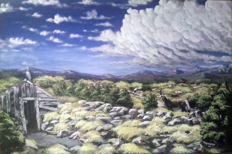
2. Vary that color in your composition from leaf to leaf and tree to tree.
3. Add a mixture of reddish or pink gray on your palette to weave in and out of the greens. This adds depth and interest to the composition and breaks up the green. I have been following this idea for sometime as I use purple as my shadow color in the foliage. I try to steer away from the use of black and have for sometime been substituting dark purple for all my shadows.
4. Prime your canvas with pinks or reds so they show through. This will help make your greens pop on the canvas.

So upon review, I guess I need to remember that if you want your "Green" to pop, trash what you learned in elementary art class and  pull out the tube of red and while you're at it, don't forget that tube of Yellow and Paynes Gray!

Happy Painting!