
Since I am a self-taught artist, with little or
no formal training to speak of, my knowledge of mixing colors is very basic and
is mostly what Mr. Easton taught me in high school art class in Eldon, Missouri. I have spent the past 2 years, going
through bottles of white acrylic paint because logic told me that to lighten a
color, add white. I would add white to my colors if I wanted to gradually
lighten the base color or to add a refection. If you add white to green
or brown it results in a color that is lighter but often I noticed that the
color seemed to loose the vibrancy and actually become duller and even
gray. I couldn't figure out why other artists have the ability to paint
beautiful landscapes that reflect bright blue skies, striking sunsets or
sparkling water. Heck, even their dirt is brighter than mine it seems.
At my first painting lesson two weeks ago, I was introduced to an amazing color that I had never heard of before...NAPLES YELLOW. It is a mixture of white and yellow ochre and maybe something else. You can find all the specific chemistry used to create this color online, but to me, it is like having SUNSHINE in a tube! I went right out and bought myself some and couldn't wait to compare the colors that I could mix.
.JPG)
I also found that I am not alone in my praise of this pigment. I found a very well written explanation on an artist forum called "Wet Canvas" that I thought I would include.
Larry says...."As
a plein air painter of subjects outdoors...I generally observe that
light and color appear warmer. It is difficult imitating color we see
outdoors in natural light, and our tendency is to add white to
"brighten" as well as lighten a color. What I have observed quite some time ago is that white is a cool color
(generally speaking)...and yes, it tints...but it also cools the color
down and flattens its potential for three dimensional punch. Cooling
down or neutralizing works against the notion of "brightening"...and is
thus counter productive for me.
What I use as a substitute for tinting closer color to maintain warmth and yet lighten is Naples Yellow. It makes lovely tints that feel warmer. As a color goes back I'll use some Naples Yellow plus white since that color would begin to lose its sense of nearness to the eye anyway, and if I want the color to appear even further back I'll use just the white to tint.
I try to be sparing with my use of white so that particular highlights I want will pop with greater depth illusion. Of course it is not always possible to avoid white...so I'll often add a bit of Naples to the mix after using white to restore some of the warmth lost.
Some will argue against this, as is their right...but such thinking has worked for me for umteen years, and I think where painting is concerned the ends does justify the means. Proof is in the pudding as they say..."
Larry (09-12-2005, 03:35 PM http://www.wetcanvas.com/forums/archive/index.php/t-294388.html)
First I took Hooker Green and mixed a small
amount of white. I also took the same amount of Hooker Green and mixed it
with an equal portion of Naples Yellow. You can see my second mixture has
a warmer glow than does the first. I have experienced Hooker Green
turning a gray tone very easily when I'm trying to paint a variety of foliage.
Trees don't look that gray to me so this isn't something I want to find
happening on my palette.

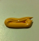
The second color I mixed was using my bottle of
Apple Barrel Chocolate Bar Brown as the base color. This really showed
the remarkable difference in tone and vibrancy as you can see by the photo below. Naples Yellow has
definitely won a big place on my palette.

Check out my website to see all my available artwork. julietownsendstudio.com. I would love to hear from you.
No comments:
Post a Comment