Showing posts with label Acrylic. Show all posts

Saturday, March 9, 2019

Good Morning Glory

It is a glorious morning to celebrate one of my favorite flowers, the Morning Glory.  I have for several years now been featuring this cheerful annual by giving it a grandiloquent presence in a number of my paintings and now drawings.  This flower is one of several flowers that has strong memories of childhood affiliated with it and beside who can resist this cheery morning flower.

I just read that I can grow morning glories in a container and so today I'm off to the home improvement store to purchase a pack of seeds and a few color flowers to accent the front of my home.  I'm so excited at the prospect of once again enjoying these climbing beauties and yet having them contained as not to get out of hand.  They will be my inspiration in a pot during the hot summer months that are coming.

Whither you want to see them or not, this is where I'm going to share just a few of my MORNING GLORY artwork work with you.  READY OR NOT, HERE THEY COME!

These first three photos are taken while the artwork is still in my sketchbook.  These pieces are drawn using Prismacolor pencils and pen and ink.  All have been done in the just the past 2 weeks.  I'm currently working on a large canvas piece that features a small jersey calf lying on the ground just in front of a huge cluster of morning glories.  This piece has been a challenge because of the size and shear number of flowers and leaves needed to pull it off.  Drawing in my sketchbook helps me be a better painter and besides these three drawings stand on their own as cute artwork.


The next five pieces are all paintings that I have complete over the past 2 years for a series of work the I call "Down Country Roads".  Each large piece features a different farm animals standing near a fence covered in bright blue morning glories.  Of these five pieces shown here in this blog post, only the last one featuring the trio of noisy geese in "Neighborhood Watch Committee" is available as an original.  I can make prints but they have all been sold and have found new homes.

If you like my artwork and are on Facebook, you might consider following my art studio page.  I always post my newest work there and on Instagram first.
@JulieTownsendStudio


Wednesday, May 9, 2018

Here We Goat Again


I wonder if this has ever happened to anyone else....I was contacted by phone in March by a lady who was at the gallery looking at my artwork. She asked how much I would charge her to draw her a goat for her grandson who just "Loves goats". I said that I get $95 for an 8 x 10" original matted color pencil sketch. A few days later I got the privilege of meeting this lady because she came to my art reception. While there, she purchased an original bunny sketch "Watching Carrots Grow" for $95 from me. She again confirmed to me she wanted a goat piece for her 10 year old grandson's birthday in May. She wanted my style and left the actual composition completely up to me.
About two weeks later I received an email from her daughter telling me to go a head and start the goat piece. That was the beginning of what I now call "Goat Month" in my studio. As my normal practice, I will do several sketches just to get ready to start a painting and I had my eye on this reference photo that I had downloaded from Pixabay.com of three goats standing up on a barn stall. I could just see in my mind just how great that would look hanging as a new addition to my "I Dare You Not to Smile" collection of art.
Baby Goat on a Stump 
I drew this sweet little goat on a stump using the same illustrated style that I have developed when drawing with my color pencils. I hoped she liked it and so I sent her a picture. She emailed back that she loved it we made arrangements to meet when I was once again on gallery duty in Boulder city. She gave me a check and I handed her over the artwork. All is good, or so I thought.
I've been trying to grow a email list that I can periodically send out a studio newsletter of sorts to inform my follows what I'm doing and my current projects. My May Studio News featured an image and a paragraph or two about goats and my newest painting "The Nanny Squad".

A few days later I mentioned my painting that I had finished called the "Nanny Squad" and talked about how this month had been goat month in my studio.
To my surprise, it was just a few days later when I get a phone call from this same lady. She states that since her grandson was turning 10 she was afraid that the drawing I did for her might just be a bit childish and asked if she could have me paint a small goat painting with maybe just one of the goats in the big painting I had just finished. She also made it clear that she couldn't afford to buy a second piece so her desire was for me to just to exchange it for a new painting.
What would you do? I thought about and felt I was in no way under obligation to exchange the artwork. She was happy with the sketch until she saw my painting of a goat and then had buyers regret.
After some thought, I really had to remember that she already was a repeat collector, a resident of Boulder City and so she may very well purchase something else from in in the future. I agreed to start a new piece for her. I painted this little 11 x 14 white goat.
Today, I just decided that when I contacted her to show her to piece and to tell her I was finished with it that it couldn't hurt to ask for additional compensation. After all, a painting is more complicated and time consuming to do and I have already established a higher price point for paintings over sketches. To my great happiness they agreed to pay me $55 more dollars they said for my hard work. I'm happy, they are happy and hopefully the grandson will be VERY HAPPY TOO!
If you like my artwork, please consider checking out My Julie Townsend Studio Website or Etsy Shop. My prints and cards are reasonably priced and I ship the prints free on my Website inside the US.


Tuesday, October 27, 2015

Draw Where You Live

The other evening, I was inspired greatly while watching several YouTube videos on the subject of plien air painting.  Both of the artists featured in these videos are extremely successful and skilled artists. They are  Lori McNee and Jim McVicker.  I have signed up to take an online webinar with Lori McNee on the "Secrets of Social Media" and am very much looking forward to all that she has to share on that topic since I love blogging and FaceBook.

The video that Lori had filmed showed her painting a river scene that is just a couple miles from her home in Idaho.  She is there quickly catching the colors and lighting with her paints.    You can really see the scene unfolding as she works.  Right in the middle of her filming session, a moose comes wondering up the river like he wants to be a part of the painting.  I have experienced the thrill of seeing wildlife up close and seeing a moose while camping in the Big Horn Mountains of Wyoming was certainly a thrill.  I was immediately jealous of her ability to be surround my such amazing scenery with such a minimal effort."A Day in the Life of Lori McNee"

The video on Jim McVickers is actually a documentary on him as an artist.  It showed him traveling all over the rugged Northern California countryside painting from a variety of landscapes.  He never uses a reference photo but rather will return to the same location several days in a row or even up to a year later to capture the same lighting conditions.  The film showed several pieces as he started with just sketching roughly in paint and then immediately blocking in the canvas with vibrant colors.  The painting rapidly took shape as the camera man captured Jim working.  Jim McVicker "A Way of Seeing"

Being thoroughly inspired, I was determined to have a positive plein air experience of my own when yesterday when we decided to head out to the desert to do some 4x4 exploring.  I usually paint in acrylics but the air is so dry here that I struggle the whole time trying to keep my paints wet enough to even get it applied to the canvas so I packed my sketching box that includes my travel watercolor kit.    

With our lunch packed and some folding chairs thrown into the back of our old Toyota 4 Runner, my husband and I headed out to the hills.  The day was absolutely amazing.  We had an overcast sky and pleasant mild temperatures.  Usually the afternoon sun wears me out but there was a perfect blanket of clouds that allowed plenty of light but not the glare and radiation that you usually experience whenever you are out in the Southern Nevada desert.  

We did some exploring of some roads out near the area of Coyote Springs and while the scenery wasn't breathtaking and the wildlife we saw wasn't anything as impressive as having a moose walk past there was still something satisfying about sketching in nature.  I did see a couple lizards and a fuzzy tarantula spider that I guess can count as wildlife.  Now that it has finally cooled off enough here I will be heading out more often with my watercolor and pens to practice some plein air of my own.

My plein air sketch of some driftwood I found in the wash

Impressive desert wildlife


I always want to know what is at the end of every road I see.  Well this was the end of the road.


In my adventures that day we had to pass through a barbed wire fence.  My shirt didn't quite make it as you can see.


Tuesday, October 13, 2015

Fence Posts


Most of my childhood memories involve growing up near the small town of  Eldon, Missouri.  We lived in a very small mobile home positioned 1/2 mile down a country gravel road off Hwy 52 on 20 acres of wooded property.  20 acres is a goodly amount of land for any child to explore and have plenty of childhood adventures.  Our house was tiny, cramped and stuffy so I recall that I spent as much time as I could outside. I had my own clubhouse at the edge of the clearing that we call our backyard.  I loved spending time there.

Our property was fenced very much like shown here in my painting.  Old fence posts strung with 3 strands of barbed wire.  The line of fence posts that bordered the gravel road that accessed our property were always painted white because my mother liked everything in the front yard, including 3 feet of the base portion of many of the trees, recycled rubber tire planters, well house, porch and our swing set all shining under many layers of white paint.  I think she would have had me paint all the rocks in the driveway if she had thought about it. 

The rest of the fence posts that separated our property from Old Man Shulte's pasture were left to succumb to the elements and slowly decay giving way to the character of the wood.  Knots and flaws in the wood probably go unnoticed by most but in this piece I wanted to show how this post still is standing strong enough to be home to many growing things.  Strong enough to still create that a barrier between the field and their grassy home.

This new painting I've just completed reminds me of home.  In the summer everything about Missouri is dominated with the color green.  There is just so much vegetation there and living in that vegetation is vast number of small creatures living their lives out in the search of food and trying not to become food themselves.  I call this piece, "Life at the Fence Post" and it is 36x24 inches and painted in acrylic.

If you like my work then please click on the link above called gallery or visit my website at JulieTownsendStudio.com

Friday, June 26, 2015

IF YOU WANT TO LEARN TO PAINT BETTER...THEN TEACH!

I'm finding a great deal of satisfaction in sharing my art with a younger generation in the form of weekly lessons.  I'm always a little nervous before they come but once we get painting that hour just flies by.  Here is a little glimpse at my home studio and the space I have designated for students. I took this photo just last week of the brother and sister students that I have intently working on painting the details on their pink zinnias.  

I was once told by a veteran artist that you really learn a great deal about your own art work, style and technique when you take that step and begin teaching.  So not only are these kids learning from me, but they are teaching me and improving my skills at the same time.   A BONUS- Weekly lessons also keeps me motivated to keep my studio space clean and organized!  

My students painting chickadees and zinnias.


To check out more of my artwork, please visit my website at:  JulieTownsendStudio.com

Sunday, May 19, 2013

There is Just Something Stunning about Birch Trees

This week I have been working on a large 24 x 36 acrylic painting that I think I'm going to call "Autumn Gold".  This painting was inspired by a collection of photos that we took while on an October hike, with my oldest son on the Galena Creek Trail, near Reno, Nevada.  A beautiful hike and has been a continued inspiration for me as I have produced a number of paintings in this past year from the photos we took.

There is just something amazing about the color and contrast that birch trees bring to a mountain slope.  The leaves have a quality that make them almost appear to sparkle when there is a gentle breeze blowing across of the mountain side.  The white of the bark glows and provides a striking contrast to the heavy pine trees in the area.

With this piece I've attempted to capture that feeling of a crisp October afternoon as you walk along a small mountain stream somewhere in the mountains.   The sounds of the breeze and water fill your ears as you stand frozen just drinking up that peace and beauty.

I might add a little bird in the pine tree but haven't decided for sure. I have used a paste medium additive to my paints for the first time.   This gave me a thicker application that I actually applied with a palette knife to give that impression of heavy bark on the pine tree.  That was fun and I think the final results turned out just as I had hoped for.


Tuesday, October 9, 2012

Hummingbirds 6 inches long

I know that I'm not the only one that finds great joy in watching the hummingbirds dart around the feeder.  These tiny creatures pack a super attitude as they dive bomb each other, chattering and scolding as they fly past.  I'm fortunate because in Las Vegas these little guys hang out all year round.

Hummingbirds have been a recent favorite painting subject of mine.  Most paintings I have observed that contain this aerial acrobats usually have a canvas full of colorful flowers and showcase these tiny winged jewels.  My idea was to compose the piece by having the flowers dwarfed by the bird himself.  Hence comes my 6 inch hummingbirds.  My friend Doug Beck from Seattle Washington has taken some fantastic photos of hummingbirds and with his permission I have used these photos as my inspiration.  Check out his work at http://desertbighorn.smugmug.com/.  You will be very impressed with his photos.

Hummingbird I- 24 x 36


Hummingbird II- 24 x 36
Both of these paintings are for sale on my website at JTownsendStudios.com if you want to check them out.  I know that I have several more paintings coming in the future that feature lots of bright flowers, feisty little winged creatures and an abundance of green.

Monday, August 6, 2012

Naples Yellow-SUNSHINE in a Tube

Since I am a self-taught artist, with little or no formal training to speak of, my knowledge of mixing colors is very basic and is mostly what Mr. Easton taught me in high school art class in Eldon, Missouri.  I have spent the past 2 years, going through bottles of white acrylic paint because logic told me that to lighten a color, add white.  I would add white to my colors if I wanted to gradually lighten the base color or to add a refection.  If you add white to green or brown it results in a color that is lighter but often I noticed that the color seemed to loose the vibrancy and actually become duller and even gray.  I couldn't figure out why other artists have the ability to paint beautiful landscapes that reflect bright blue skies, striking sunsets or sparkling water.  Heck, even their dirt is brighter than mine it seems.

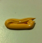
At my first painting lesson two weeks ago, I was introduced to an amazing color that I had never heard of before...NAPLES YELLOW.  It is a mixture of white and yellow ochre and maybe something else.  You can find all the specific chemistry used to create this color online, but to me, it is like having SUNSHINE in a tube!  I went right out and bought myself some and couldn't wait to compare the colors that I could mix. 


I also found that I am not alone in my praise of this pigment.  I found a very well written explanation on an artist forum called "Wet Canvas" that I thought I would include.
Larry says...."As a plein air painter of subjects outdoors...I generally observe that light and color appear warmer. It is difficult imitating color we see outdoors in natural light, and our tendency is to add white to "brighten" as well as lighten a color. What I have observed quite some time ago is that white is a cool color (generally speaking)...and yes, it tints...but it also cools the color down and flattens its potential for three dimensional punch. Cooling down or neutralizing works against the notion of "brightening"...and is thus counter productive for me.

What I use as a substitute for tinting closer color to maintain warmth and yet lighten is Naples Yellow. It makes lovely tints that feel warmer. As a color goes back I'll use some Naples Yellow plus white since that color would begin to lose its sense of nearness to the eye anyway, and if I want the color to appear even further back I'll use just the white to tint.

I try to be sparing with my use of white so that particular highlights I want will pop with greater depth illusion. Of course it is not always possible to avoid white...so I'll often add a bit of Naples to the mix after using white to restore some of the warmth lost.

Some will argue against this, as is their right...but such thinking has worked for me for umteen years, and I think where painting is concerned the ends does justify the means. Proof is in the pudding as they say...
Larry (09-12-2005, 03:35 PM  http://www.wetcanvas.com/forums/archive/index.php/t-294388.html)


First I took Hooker Green and mixed a small amount of white.  I also took the same amount of Hooker Green and mixed it with an equal portion of Naples Yellow.  You can see my second mixture has a warmer glow than does the first.  I have experienced Hooker Green turning a gray tone very easily when I'm trying to paint a variety of foliage.  Trees don't look that gray to me so this isn't something I want to find happening on my palette.


The second color I mixed was using my bottle of Apple Barrel Chocolate Bar Brown as the base color.  This really showed the remarkable difference in tone and vibrancy as you can see by the photo below.  Naples Yellow has definitely won a big place on my palette. 

Check out my website to see all my available artwork.  julietownsendstudio.com.  I would love to hear from you.