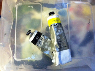
I had the occasion last week to ask several artists about what was the green that they used most and I was shocked when I was told by my very accomplished artist friend, Lily Adamsczyk, that she never buys green, but rather she mixes yellow and paynes gray to achieve the green that she desires. I was shocked to say the least. I thought you mixed blue and yellow to make green or at least that was what I was taught in elementary school art class.
The second artist I asked named sap green as her favorite but then immediately she began clarifying the fact that because sap green is a two pigment paint that phthalo green was probably a better choice. I didn't admit this fact to her, but I was lost back at the "two pigment part." I realized, that just like composition rules, there is a whole science to paint colors that go far beyond the blobs of paint I squeeze on my palette when I begin preparation to start a new painting. There is SO much to this painting stuff that I know so little about.
I must not be the only one that has issues with GREEN because in the book, "Color and Light" by James Gurney, there is a whole section dedicated to this problem called "The Green Problem." In this chapter, Mr. Gurney gives the following tips for helping with my GREEN problems.
1. Mix your greens with a variation of blues and yellows so that the color is weaker and varied.
2. Vary that color in your composition from leaf to leaf and tree to tree.
3. Add a mixture of reddish or pink gray on your palette to weave in and out of the greens. This adds depth and interest to the composition and breaks up the green. I have been following this idea for sometime as I use purple as my shadow color in the foliage. I try to steer away from the use of black and have for sometime been substituting dark purple for all my shadows.
4. Prime your canvas with pinks or reds so they show through. This will help make your greens pop on the canvas.
So upon review, I guess I need to remember that if you want your "Green" to pop, trash what you learned in elementary art class and pull out the tube of red and while you're at it, don't forget that tube of Yellow and Paynes Gray!


No comments:
Post a Comment