
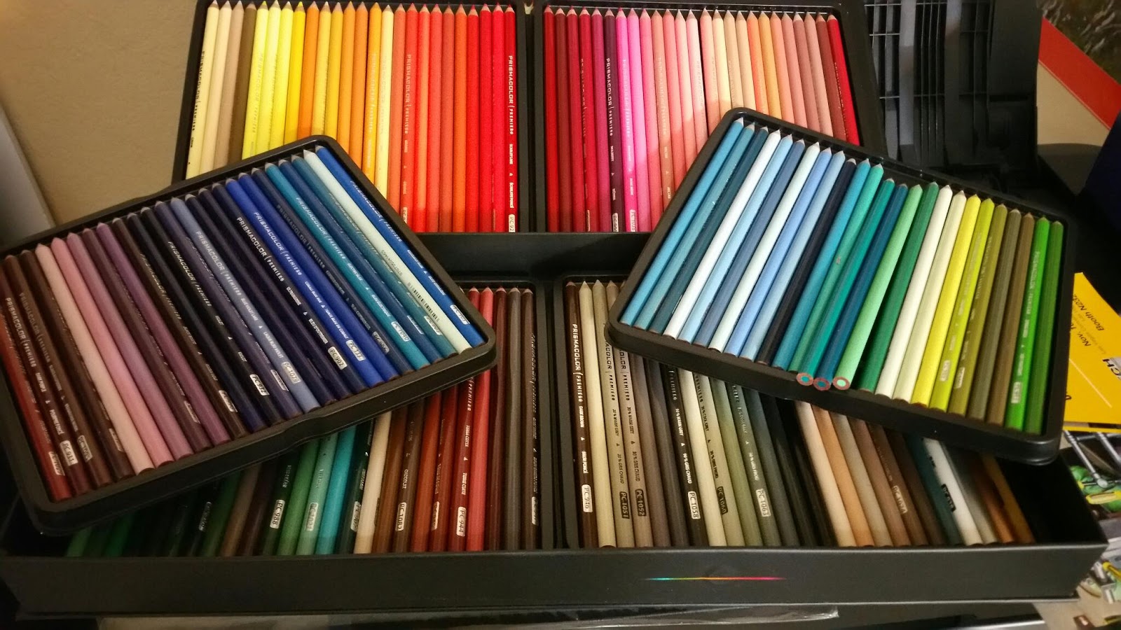
 I don't know, but I think I just might have enough colors now when I sit down to do my next sketch. Just look how beautiful they look. It's like a rainbow in a box and and I'm SO EXCITED! This is the REALLY big box of Prismacolor pencil. There are 150 to be exact and I can't wait to start using them. Just look at all those shades of gray and blue!
Lately, I have been watching a talented color pencil artist from Australia by the name of Sheldene Visage at Sheldene Fine Art. She has a number of excellent tutorials on YouTube and I'm learning a great deal from her. I decided that if I was serious about the medium of color pencils then I needed to invest in the largest set they sell. I guess I'm just going to have to get busy and sell a bunch of greeting cards or a couple cowbells to cover my investment.
 To make myself familiar with all the colors available in the set I decided that I was going to make my own color reference chart to go along with my pencil set. I used 4 inch strips of poster board separated in 1/2" sections. Each try contains 25 pencils and so my color chart follows that same order that they were shipped. I'm really hoping that Prismacolor wouldn't steer me wrong. I can use the little swatches of color when trying to determine the closest shade. I can just lay the card up to the reference photo or still life and find the right color.
Sheldene has her color charts hole punched and on a ring so that they stay together but she can have access to each card separately. I was even considering the possibility of having them lamented so that they are protected so they stay clean and intact. Maybe I will do that as soon as I'm sure I have them organized correctly and that they are functional. I may decide that I need to expand the color to include both a dark and light tone for each color. So many decisions just to get organized. At this point, I'm not even certain the best way to keep my pencils organized. Maybe that is a good question to ask several experience CP artists and include their answers on a future blog post.
 |
| Example of Color Swatches done by Sheldene |


