Showing posts with label green. Show all posts

Thursday, March 5, 2020

Spring Green, Lime Green or Chartreuse it all means GREEN THUMBS for me

8 x 8 Spring Bee Paintings
Spring is HERE in Las Vegas!  We are forecasted to have weekend temperatures in the 80's and I've added nightly allergy medication to my evening med lineup.  Yes, tis the season of sneezing and stuffy noses.  It is also such a sweet time of new life and brilliant colors.

Yesterday, I even planted some morning glory seeds in my big flower pot outside and added basil to my herb garden.  Besides dirt under my nails, I'm finding my thumb to be green and I'm not referring to the "green thumb" you have when they say you are a gardener.  No, I'm talking a literal GREEN THUMB from all the painting I have been doing this week.

Did you know that CHARTREUSE is the ETSY color of the year?  I found that out last week and ever since then I have had a big pile of bright green paint on my palette.  These little bees have been so much fun to paint.  I started out with painting (3) 6 x 6 x 1.5 canvases with colorful abstract flowers and then adding bees.  The green is just so alive and vibrant as a background color.  Now I have moved onto cowbells and mini bees on 4 x 4 x 1.5 canvases.

Work in Progress- Cowbells and Mini Bees


Sleepy Bee design with scripture on ETSY


Another "BEE" art piece that I created this week involves my "Sleepy Bee" design and a scripture.  Here I have created a matted print available in different sizes, a blank note card and a laminated magnet.  This design is available for purchase on my ETSY SHOP at this LINK


Tuesday, October 11, 2016

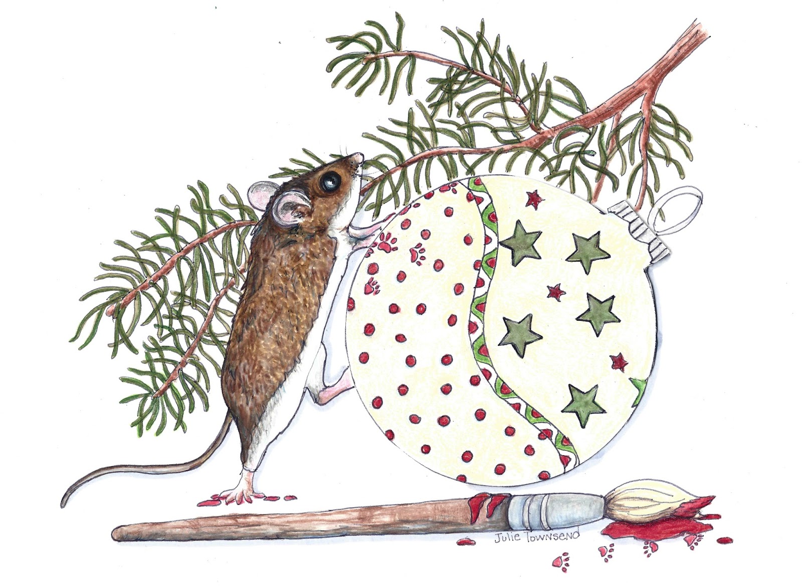
Not a Creature was Stirring "EXCEPT FOR THE MOUSE"


Except for the Mouse
There is nothing like the chill that comes to the morning air in October.  I'm thankful that I have once again survived another hot summer of oppressive heat of the Mojave desert and blessed with a feeling of  renewed energy and creativity.

As an artist, I really should be working on my Christmas ideas in July but that is just so hard to do when all you're trying to do is to stay cool.  So here it is in October and I'm feeling the pressure of getting my Holiday designs down on paper.  My goal is to have four or five unique sketches created by the end of this week.  I have these two so far.

With both of these designs were so much fun to draw.  I found myself smiling most of the day as I added in the details of these furry little decorators.  

All day the words to the famous Christmas poem by Clement Clarke Moore, "Twas the Night Before Christmas, when all through the house.  Not a creature was stirring, not even a mouse" kept rolling around in my head. The difference was that I would change the last phrase to "Except for the Mice".

Decorating Committee
These little guys are hard at work putting on the final touches of the decorations and you can see just how hard they must work to get the ornaments hung just right on the tree and this beautiful wreath so it can be hung on the door to welcome with cheer everyone that visits.  So I'm calling these "Except for the Mouse" and " Decorating Committee".

If you would like to check out more of my work, please feel free to visit my website.  I work hard trying to keep it updated with my new pieces but sometimes that is a challenge when you draw and paint as much as I do.  Here is the Link: JulieTownsendStudio.com

Tuesday, May 17, 2016

Veggies are the Bomb Diggity

This past week I have found myself busy and distracted so not much art has really gotten done.  I did manage to write this little poem (which I hope you read at the bottom of this post)  to go along with one of my favorite sketches that I have done this year.    There is something just so cute about this little bunny sitting among a pile of fresh carrots.

This weekend I was blessed to be invited to attend a baby shower for the grandson of a dear friend.  I purchased a couple of very cute outfits to give the new mother as a gift but at the last moment decided to also include this piece and my sketch of a calf licking his nose.  I printed them out on acid free art paper, matted them and signed them.  I also included the poem I wrote for "Who Needs a Tissue". (To read that poem just scroll down to my May 7, 2016 post)  I think that these two prints make wonderful nursery art or would look great hanging in a country kitchen.

So this got me thinking about the holiday weekend coming up and so I decided to put together a blog special offer.  I usually sell these 8 x 10 matted to 11 x 14 inch prints for $45 each but for the next two weeks (ends May 31, 2016)  I am offering a special package to my online blog and website visitors only.  Both numbered and hand signed prints, along with a copy of both of my poems for $50 (plus $13 shipping in the good old USA). Here is the link to my Down Country Roads Gallery.  Just click on the Paypal button located at the top of the gallery to make your purchase.  While you are there, please feel free to checkout my other gallery tabs for my other works at JulieTownsendStudio.com.


"Don't Forget Your Vegetables"


"Who Needs a Tissue"


Don't Forget Your Vegetables
By 
Julie Townsend

I don’t understand it at all when I say
There are people I know that are not at all keen
To eating anything that is leafy and green
It is perplexing to consider the price they may pay
For eating our veggies is one way to stay
With your body fueled and your muscles lean

Packed full of good stuff with very long names
Plenty of essential acids, vitamins and minerals galore
All vital and important items needed to fuel your core
I’m not joking, pulling your leg or making false claims
This is for real and I’m not playing games
Eating the colors of the rainbow will help you soar

Red is good for your heart
Blue and purple work wonders for you brain
Green is packed with essential minerals so you don’t feel the drain
Filling your plate with lots of bright colors will get off to a good start
To keep your eyes healthy and reading off the chart
Orange and yellow are the colors for vision that will bring the most gain

All that about color just to say
Don’t forget to eat them 5 times a day
The
 Incredible
Very Digestible,
Always Sustainable,
The tasty and edible
Yellow, Orange
Purple, Blue
Green and
Red
V
E
G
E
T
A
B
L
E


Leave me a comment below to let me know if you like either the artwork or my feeble attempts at writing poetry.  Catch you on the next blog post.


Thursday, July 25, 2013

What is your favorite summer fruit?

One of the many things that stand out in my mind when I think of summer is all the wonderful fruits that are in season, especially watermelon.  I try to buy one a week because there is just something refreshing about cold sweet watermelon on a hot summer day and in Las Vegas the word HOT is an understatement.  So when the City of the World Gallery that I am part of announced a summer art contest amongst the artists for the month of August this idea of a colorful pile of lemons and berries along with beautiful sliced watermelon came to mind.  I decided to add the blue straw to composition and title this piece "Taste of Summer".

It's a big change from my normal gold prospector or Nevada landscape but it was a lot of fun.  I don't think I have used so much yellow on one palette before.  I hope you enjoy the piece and I encourage you to come stop by the gallery on the corner of Casino Center and Colorado for next weeks "First Friday".  I'm sure there will be some great SUMMER art to see and you can probably find a cold glass of lemonade to enjoy.


TASTE OF SUMMER- 18x24 Original Oil Painting

Thursday, November 22, 2012

Light and Contrast


Taking private painting lessons would be a complete waste of money if I didn't apply the things I learn in each following painting.  In seven lessons, I have really only accomplished one painting to completion, but I have taken several pieces that I have completed independently to have them evaluated.  As I have blogged on previous occasions, my instructor, Lily Adamzcyk gives a brutally honest critique of each work.  Techniques have been analyzed such as how to paint specific elements like grass, water and never use white to brighten.  Probably the most important lesson I have tried to implement is that of light and contrast.  For a painting to have depth and interest you must have both. 

Keeping that in mind I began working on this large piece that was inspired by a fall hike that I took with my son and daughter-in-law near Reno.  The colors were just beginning to change and the birch trees nearly glowed in contrast to all of the darker pines.  The bright morning sunlight filtered across the trail whenever the foliage gave opportunity. 

Because of their prominence in the composition, you would first think that my main focus here is the grouping of the three birch trees near the trail but in actuality, it is the sunlight that is really the star here. I have attempted to show the trail and grass highlighted by the sunlight in a number of locations.  It is almost as if you have walked out of the darkness and into the light as the trail absorbs the energy and warmth of the morning rays.  This energy continues as the trail briefly disappears only to return brighter as you are prompted to continue up the mountain.

At my next lesson, I am sure that there are refining details that Lily will use to help me improve this piece but I think that she will immediately know that I have been listening.


24 x 36 Oil- "Morning Sunlight"

Monday, October 29, 2012

Watch Grass Grow

I have blogged a number of times about my painting lessons that I am taking with a very talented local artist by the name of Lily Adamczyk.  If you have followed any of my former blog posts you know that I have been painting only for the past 2 years and have been using acrylics up to this point.  Taking lessons from an accomplished artist and learning a new medium like oils can open one up to a new level of critiquing that facebook friends or family dare not provide.  In their defense 1. they probably don't want to hurt my feelings and 2. even with all my bad habits I demonstrate a level of skill they may not have themselves.  

I chose for the subject of my first solo oil painting a field with three longhorns.  Well, actually two longhorns and a calf.  We took this photo somewhere along the road while traveling in Nebraska.  I loved the look these bovine gave us as we forced my 14 year old niece to stand in a field of corn so that we could take her picture. You don't come across too many fields of corn in the Nevada desert so we made her pose all across the countries bread basket states.  Actually, now that I think about it, I haven't seen too many longhorns in Las Vegas either.  Regardless of what crazy things we were doing to make them stare at us like this, I loved this photo and knew immediately that I wanted to try and paint it.


So as I began painting out my scene on the blank canvas, I couldn't really get around the fact that my subject was surrounded by a great deal of green grass.  I decided to split that up with a small stream running across and to have a distant barn on the horizon.  As I posted this painting on facebook, I received a number of compliments about the way I painted my grass.  So, I proudly carried my partially completed work to my most recent painting lesson so that Lily could get a close up look at my masterpiece.  I was sure the she would like the way I handled the long grass in this composition because I tried to follow her instructions on the painting I had done previously that I call "Memories of the Road Home".  Boy was I WRONG!!! 


Lily's first comment to me was that she see me making this mistake all the time and she is going to break me of my bad habits, especially when it comes to painting grass and having things springing up from the edges of my canvas.  I guess that meant that she didn't like the tree I added in the corner.

The first correction she had me do was to add more contrast to the grass areas by adding brown squiggly lines in different directions. After these are completed, I'm going to come back in with a light ochre to simulate the grass that has gone to seed in my photo.


With this close up, you can see that I have started adding the contrast to the grass and have worked to DEFINE the BOVINE by darkening the shadows and highlighting the areas that are being impacted by the sunlight.  I can honestly say that this action has resulted in a marked improvement.  Lily is always right.

This is close up of an area that I have not yet added the contrast and I can see what a difference this makes in the overall feeling of the grass.  

I was thinking about the fact that for so many year I have not viewed nature with "ARTIST EYES" and now I am trying to interrupt what my memory remembers it to look like.  The randomness and imprefections that exists in nature is missing from my pieces because I'm trying to interrupt it and not really obeserve it.  What I really need to do to improve my paintings, is get outside and literally "WATCH GRASS GROW".

Nosey Girls- 18 x 24 (Oil)

Tuesday, May 15, 2012

Green is a Problem

It wasn't that long after I picked up my brushes and started painting again that I realized that I was having difficulty being satisfied with the colors in my paintings.  I never seemed to obtain the vivid colors that I had desired and had envisioned.  I specifically noticed my frustration with the color green in particular in my compositions. I just felt they lacked the depth of color and usually as I kept attempting to brighten my foliage I would find that the end result was a tree completely overworked, lacking the definition that I desired. Is the problem the actual shade of green that I had purchased? I would stand in front of the paint display, looking at the different names listed. Hooker Green, Permanent green, Chromium Oxide Green, Sap green, phthalo green, and so on and so on... What was the name of this illusive green paint that I really needed on my palette?

I had the occasion last week to ask several artists about what was the green that they used most and I was shocked when I was told by my very accomplished artist friend, Lily Adamsczyk, that she never buys green, but rather she mixes yellow and paynes gray to achieve the green that she desires. I was shocked to say the least. I thought you mixed blue and yellow to make green or at least that was what I was taught in elementary school art class.

The second artist I asked named sap green as her favorite but then immediately she began clarifying the fact that because sap green is a two pigment paint that phthalo green was probably a better choice. I didn't admit this fact to her, but I was lost  back at the "two pigment part."  I realized, that just like composition rules, there is a whole science to paint colors that go far beyond the blobs of paint I squeeze on my palette when I begin preparation to start a new painting.   There is SO much to this painting stuff that I know so little about.

I must not be the only one that has issues with GREEN because in the book, "Color and Light" by James Gurney, there is a whole section dedicated to this problem called "The Green Problem." In this chapter, Mr. Gurney gives the following tips for helping with my GREEN problems.
1. Mix your greens with a variation of blues and yellows so that the color is weaker and varied.
2. Vary that color in your composition from leaf to leaf and tree to tree.
3. Add a mixture of reddish or pink gray on your palette to weave in and out of the greens. This adds depth and interest to the composition and breaks up the green. I have been following this idea for sometime as I use purple as my shadow color in the foliage. I try to steer away from the use of black and have for sometime been substituting dark purple for all my shadows.
4. Prime your canvas with pinks or reds so they show through. This will help make your greens pop on the canvas.

So upon review, I guess I need to remember that if you want your "Green" to pop, trash what you learned in elementary art class and  pull out the tube of red and while you're at it, don't forget that tube of Yellow and Paynes Gray!

Happy Painting!

Saturday, January 28, 2012

Christmas Memories

 I just finished a Christmas painting this week.  I was so inspired by the photo of my best friend's granddaughter that I couldn't help but loading up my brushes with bright red and green.  Christmas is past but I just couldn't wait when I first saw the photo of 3 year old Aubrey, I knew that I had to try and capture that image.  It was like something straight out of the Hallmark Store or a Norman Rockwell Saturday Evening Post.  I've tried to capture that Christmas memory on canvas.  The smell of the pine, crack of the fire and the sweetness of childhood are hopefully all present in my rendition. I made my little girl a bit older and I had to add the old brick fireplace, complete with hung stockings on the mantle and a stuffed bunny to finish off that memory of Christmas past.

"Christmas Memory" is an original work created in my studio in Las Vegas.  It is painted with Acrylics on a 16 x 20 canvas and is framed in an antique wooden frame that just goes with it perfectly.  I sure hope you enjoyed your visit and please come in and check out what is going on in the studio.