Showing posts with label Website. Show all posts

Tuesday, October 22, 2019

What Country Kitchen is Without a Cast Iron Frying Pan?

I'm so excited about this new studio product that I am now offering.  Well, it's not exactly new I did paint a few last year but I feel that I have now brought it to it's full potential.

What is this "thing" that I am referring to?  My CAST IRON SKILLET ART of course.  A small piece of artwork, framed in a real 6.5 inch cast iron skillet.  It makes the perfect addition to any Farmhouse kitchen and now you can change out the artwork for the seasons or just to fit your mood. I even had recorded my first Studio Youtube video about them.   I told you I was excited.


Here is a quick snap shot of all the artwork I have painted in the past 2 weeks to go along with my skillet art.  I will be taking these all to the Pomegranate Festival in Logandale, Nevada on Nov 1st and 2nd.  I'm hopeful that these will turn out to be as popular as my cowbells.  

After the festival is over,  I will be adding both my available cowbells and skillets to my Website and Etsy Shops so that you can browse through the selection in plenty of time for your holiday shopping.


Farmhouse Art, Farm Art, Julie Townsend Studio
Here is the WHOLE BARNYARD FAMILY of skillet art pieces

Farmhouse Art, Farm Art, Julie Townsend Studio, Sheep, Pigs, Cows
Skillet art featuring sheep, cows and a pig


Farmhouse Art, Farm Art, Julie Townsend Studio, Goat Art, Cowbells
Goat Cowbell and Skillets

Farmhouse Art, Farm Art, Julie Townsend Studio, Cardinals, Cowbells
Cardinals galore- both cowbells and skillet art

Friday, January 4, 2019

Time to Get Rid of the Dust and Cobwebs

With the coming of a new year, there are lots of resolutions and commitments made to improve health, making new goals and promises to finally get organized.  There is just something uplifting and inspiring about new starts, new beginnings and new calendars.  It is also the perfect time to give your online presence a good cleaning up.

That is what I've been doing the past couple days.  It is important for me to maintain the branding I have already created for myself so I want to make sure that all my online platforms have a similar look.  I'm pretty happy with the changes I've made so far.

First, I'm still considering changing up my motto from "Telling Stories with my Paintbrush" to "Telling Paintbrush stories To Make You Smile".  I really like the idea of working the concept of the Smile into my motto.  From experience I have first hand observed over and over the reaction that my art causes when an individual steps into my booth or views my display and I can honestly say there is usually a smile involved. 

So let me show you what I've come up with for my website home page.  It is so important that the first impression you get is visually impacting.  You want your website landing pages to grab you and make you want to stay.  I'm hoping that from there the natural thing to to is to checkout the rest of my tabs and spend sometime in my gallery and not just immediately click on to the next site.

I've chosen Dancing Script as the font for my studio name and KG Be Still and Know as the second font.  It is really important that you stay consistent with the details.  I can make some adjustments with the layout of the artwork across the different platforms but the font needs to stay the same.

Here is an example of a page banner design that I created to use on my Facebook Studio page or on my Etsy Shop.  You can still see the theme remains the same.

business card front


Another extremely important marketing tool is that of your business card.  Here is currently the draft of what I have worked out for my new design.  I'm not quite ready to order cards yet so I will probably make a few adjustments.  I do have my phone number listed on the back of my card but covered it up here on my blog for privacy sake. 

business card back


So I encourage you to take some time to consider your website, Facebook Page or Blog and perhaps do some sprucing up of your own.    It is amazing how just a change of color palette, font choice or adding a few images can make such a difference.  If you don't have an online presence for your art or whatever creative outlet you do, then I encourage you to make that a goal for 2019.

Feel free to comment below or message me if you have questions about marketing.  Please consider following me on my Facebook Studio Page 


Wednesday, July 11, 2018

The JIG is UP for this Scammer


I was contacted by one Anthonio Jack via my art website this morning and immediately I was skeptical of him mostly because there just wasn't something right about his use of the English language.  His words just didn't seem to flow smoothly.  He also kept calling my art a "piece" of work when you would normally refer to a body of work as plural and not singular. 

A quick Google search of "Anthonio Jack"  was all it took for me to be informed.

This message was WORD for WORD the message I received.  You would think he would be smart enough to realize he needs to change it up from time to time but I guess scammers aren't really smart to begin with.  Anyway, I didn't waste a moment on this junk and told him that the "Jig was Up! and to go crawl back under the rock he came from." 

Here is one warning of many I found

Beware Of Anthonio Jack


I got email through the website and research revealed it's a scammer. Heads up.


From:
Anthonio Jack


Subject:
ARTWORK

Message:
Greetings,
My name is Anthonio Jack from Oregon.. I actually observed my wife has been viewing your website on my laptop and i guess she likes your piece of work, I'm also impressed and amazed to have seen your various works too,You are doing a great job. I would like to receive further information about your piece of work and what inspires you.. Kindly confirm the availability for immediate sales..
Thanks and best regards.. 

Sunday, May 6, 2018

Taken to the Graphics Wood Shed


I've been doing very limited graphic designs for a while now and they have all been for my personal use.  I'm not a professional graphic designer and never plan to be.  I taught myself a little Photoshop in July and I have been non-stop designing marketing materials for myself ever since.  I am proud of that fact.  See, you can teach an old dog new tricks.

Here are just a few of the examples of designs I created recently.  My art show marketing postcards, my banner and this adorable marketing image to share on my social media accounts.  All turned out just the way I wanted them to; colorful and humorous. I think they are just a perfect fit for my artwork.


The past 9 months have been amazing.  I'm loving the Photoshop I have learned and it allows me to create so many things.  Photoshop has taken my artwork to a whole new level  Now let me remind you, that I have had no formal training in either art or graphics so everything you see here is created from basically my gut feelings and my creative eye.  I just found out that BOTH HAVE BETRAYED ME!

Not only have I created my own monthly studio newsletter and marketing cards, I am always busy designing things for the Art House LV Gallery here in Las Vegas.  I am one of two volunteer directors at the gallery so you can just imagine how many hats I must wear.

One of my favorite marketing themes as of late, is to use images of members of my family and add them into different funny settings that then advertise the gallery.  Here are just a few of social media marketing images I created for the Art House LV Gallery.


I have also published several newsletters in the past 9 months to promote the gallery.  Here you can see the front and back pages of my most current newsletter.  I love the bright colors and how I have the daisy wrapping between the two pages.  I was so pleased at how this turned out....That is until just the other night when I was chatting with one of the younger gallery photographers and to my complete shock and dismay he said to me, "I have hesitated to tell you this, but since we are discussing the newsletter, I just thought you should know that no one in the graphics field uses COMIC SANS as a font anymore. It works for what you are doing but really shouldn't be on the gallery website or marketing materials."

At that moment, I felt as if my whole world had changed.  I mean COMIC SANS has been my standard go to font for everything.  I even have it set up as my default font for my emails.  How could I not know this?  I'm just now learning that it is right up there with the font Papyrus. Yes, I did watch the SNL skit regarding the Papyrus font being used on Avatar.  I think the humor was lost on me at that moment.

I came home from the gallery and in a moment of weakness I posted my misery for all my Facebook Friends to read.  That is when I received my enlightening to the errors of my ways.  These friends held nothing back.

If you think you might like my art, please check out my Etsy Shop or my website gallery and please don't tell me if it is also in COMIC SANS font because I haven't checked there yet.


FACEBOOK DISCUSSION THE OTHER NIGHT REGARDING COMIC SANS FONT:

ME:  I'm just a bit upset right now. I was just informed that graphically speaking, Comic Sans as a font is just a bad choice. That is like my go to font. Now I have to rethink everything.
LG: It's art, art is at the discernment of the viewer. That being said art may be judged by the viewer but that judgment shouldn't be pressed on others.

VT: This applies to everything else in the except comic sans.
           ST: Did they recommend a different one? lol!

Manage

ME: Not really...um just left in the void of graphic space. It's lonely out there. Lol

Manage
LB: The most likely reason you were told so is that it’s one of the first fonts use, and overused in books & other graphic design platforms. But who care? It works great with what you’ve been doing.

Manage


VT: Literally any other 100k fonts would be better.

ST:  All this time everyone stayed quiet! ðŸ˜‚😂😂😂


VT: The thing with comic sans, in my opinion, is that when we started doing graphics in the late 80's, you had a choice of about 3 fonts. Comic sans was the "coolest" one. So to still be using it gives the illusion of not progressing in the last 30 years.


VT: Jules, do you use dafont? Lots of fun choices. Try "eponymous" or "century gothic"

ME:  VT,  I have downloaded a few fonts from there but it is overwhelming. Rest assured I will be getting out of the 80's now. This all steamed from a conversation I had with XXXXX last night about the website. I've only been doing graphics for the past 9 months or so and I just had no idea. Well I have been EDGUMACATED now!

LG:  Again opinions lol


KA:  Agree LG Some people are still hippies!!! BE YOURSELF. Font snobs!

Thursday, September 1, 2016

Just Another Pond Scum Sucking Scammer Trying to Steal My Artwork

Have you heard about this scam?  Well if you are an artist, BEWARE!


My Beautiful Artwork being packed up to ship
I've been traveling the country and haven't had a chance to post to my blog this past week, even though I have had several updates that I wanted to share.  

The biggest news that has happened recently is that I was the target of a scam.  I know I have heard a number of scam scenarios perpetrated on artists and so I was weary when I received a solicitation for my information on my website regarding a desire for several pieces of art.  I sent my reply promptly to the email address of a woman named Linda Rudy in Miami Shores, Florida.       

A week later she expressed a desire to purchase three pieces that came to a total of $600 with shipping.  I sent her a PayPal invoice and waited.  Another week went by before I received an email telling me that her husband's assistant and mailed the check and I should be receiving it either that day or the next.  She asked to be contacted as soon as I received the check.  

With that information, I decided to go a head and package up the artwork so that it was ready to ship. We were leaving later in the week for Georgia, so my plan was to take the package with me and as soon as I was sure the check was good and not going to be returned I would mail the package somewhere on the road.

I was SO excited as this was going to be my very first website sale.  I have worked so hard making my website and keeping it current.  I just remind self often that someday all that hard work will pay off.  I was starting to feel confident that this was that time.  (Checkout my website at JulieTownsendStudio)

As expected, the check arrived the following day.  I opened the USPS express envelope immediately and noted that inside was only a check with no note or other information.  I pulled out what appeared to be a legitimate cashier check made out for not $600 but for $2150.  I knew immediately this was a scam.  I was sure beyond doubt that my next contact with this "Linda Rudy" would be giving me instructions as to where I was suppose to send the overage. Rather than making $600 on the sale of my beautiful artwork, I would soon be out $1550 and my artwork.  No matter how anxious I am to have my first true website sale, I would never try to cash that check.  I find it so sad that there is such crooks out there trying to steal from hardworking individuals like myself.  I pour everything I have into my artwork.  You have to put yourself out there for public viewing and so we have websites and social media accounts to sell ourselves and so I guess this is a natural outcome.  

I thought it would be good to actually share the exacting wording of her reply to my email informing her of the error.  Maybe with sharing this I will somehow save another artist from making a big mistake.

So here is the actual email I received:
On Aug 24, 2016, at 4:44 PM, Linda Rudy <theowallcot56@gmail.com> wrote:
Hi Julie,
Good to hear you have received the payment. I am so excited you have
received the payment and can't wait to have the artworks on my wall. I
hope to give them a very good home and enjoy the pieces for many
years.

Regarding the check , my husband made a terrible mistake and overpaid
you because he didn't have full details of the transaction since I was
too busy when he sent it. I am very sorry for the confusion but I will
like you to go ahead and deposit the check today, deduct the cost of
the artworks plus shipping to my address below . Then you can forward
the difference back to him. The shipping address is below..

1481 NE 104th St
Miami Shores, FL 33138

Meanwhile, I spoke with my husband  now and he will like you to
forward the difference back to his chief accountant.A Money order or
cashier check should be made out to "Takeisha Carruth" and send to the
address below.

Takeisha Carruth
458 old buena vista rd #5
Columbus Ga 31906

You can send it via FedEx or UPS overnight delivery. Kindly take care
of this as soon as possible and get back with the tracking number.
Thank you.

Best Regards,
Linda.
Here is my reply to whoever it actually was that I was emailing:
"I'm sorry but I wasn't born yesterday.   I'm not comfortable at all with depositing this check in my account.    I really insist if you want the artwork then please follow the link to the PayPal invoice I emailed you last week.  Do you need me to resend that invoice to you or would you prefer I send it to your husband and or his assistant?

When I have confirmation of the PayPal transaction that I generated being complete, I will be happy to ship you the artwork to the Miami Shores, Fl address, otherwise I guess you are out the postage to mail me the check and I've wasted my precious time packing up my artwork and writing you a sincere thank you note."


Monday, July 4, 2016

Website Building for Dummies


I have for sometime used Weebly as my preferred website platform.  Generally, I am pleased with the overall look and functionality of my website and I stay diligent on keeping it updated.  I am always thinking of ways to improve it.  My website has undergone many major changes at different times and I'm sure it will be getting overhauled again in the future.  You learn as you go and I'm committed to being a lifetime learner.

One thing I did in the past year was start researching the website of other artists.  You know those successful artists that actually make a living selling their work.  I figured these folks had money to invest in having a professional design their sites and I could learn a lot just by trying to copy their look and incorporating it into mine.  Believe me I see plenty of artist at my level that either have no online presence or it is so poorly done that I feel sorry for them. I may not have the art sales I dream of but it's not because for a lack of effort.  I believe that if you BUILD IT THEY WILL COME!

Template- Weebly has a great many website templates to choose from.  Using a template already designed doesn't mean your website is going to look generic or cheap.  There are plenty of ways to customize the overall look and feeling of your website with custom banners, unique colors and market specific apps.

Since my main focus in my artwork has a strong country and western flavor, I loved that Weebly finally has a old wooden fence background template to choose from.  It is perfect and I LOVE it for my website.  I'm glad they have added a ton of fresh graphics that weren't available when I first started my website.  I also picked a simple white to surround my artwork.  My work is colorful enough and since I love to frame my artwork with a thick black border I think it gives a nice clean look that doesn't compete with the main thing I want you to notice-MY ARTWORK!

Home Page-  You have maybe 2-3 seconds to capture your audience and that is why your home page is SO very important.  I noticed that many artist websites that I looked at had just a few works displayed or perhaps a fast moving gallery that showcased their best pieces.  Usually their name and contact information might also be reflected on their home page.  That was pretty much it. So armed with that I made some major changes.  The bio and artist statement has no place on the home page.  Just beautiful and colorful artwork to entice the viewer to take a closer look.  (Sorry for the blurry iPad screen shot photos(

This is my Home Page of my website at JulieTownsendStudio.com
           My Home Page

ABOUT JULIE- My second tab is called "About Julie".  This is important for any potential customer to be able to learn more about you in depth.  Upon hitting that tab my artist bio and statement will appear.  A side note about this bio- It is important to get a good photo of yourself.  No matter how you feel about it, you are the product and people want to know you personally as the artist.  I had taken a webinar by successful artist, Lori McNee and one of the biggest takeaways that I learned was the importance of using the same well-done profile picture on every social platform.  This profile picture was taken by a fellow photographer artist, Marie Davis.  Several months ago she offered to take free head shots for any gallery artists to use on the gallery website.  This picture turned out well enough that I decided to use it on everything.  This is called branding yourself and I can't overstate the importance of this. Facebook, Blogger, Pinterest, Instagram, Twitter, Google Plus, Etsy and this website all have the same profile picture.  I even find it very important to have this picture hanging on my gallery wall.  Facial recognition is key and I think I'm the only artist at City of the World that has a picture of myself hanging on the wall.  Sad because I think this is extremely important.

VERY IMPORTANT- GET A GOOD PROFILE PICTURE TAKEN!
I use the same profile picture across all social media platforms

On this page I have it separated into my Bio and my Artist Statement.  Both are very important in understanding who I am as an artist.  If you don't have these written down somewhere I want to urge you today to get working on them.  There are plenty of examples and templates online to assist you and you can always edit make changes as you get more experience.  
My Bio and Artist Statement

Under this tab I have 3 tabs to choose from.
Three Tabs Under the "About Julie"

RESUME- This is a listing of awards and important recognition that I have received since being an artist.  Now most of them are pretty lame compared to many successful artist that have been on their journey longer than I have but you need to keep track and now matter how small add it to your resume list.  It is a great visual of your journey and will help you see your progress as an artist.


CURRENT GALLERY REPRESENTATION- It is important to give your website visitors the ability to visit your work in person at all the galleries that you have your work hanging in.  I've included their address, phone number, contact person and their website.  They market you and it is important that you in turn market them.  It is a two way street and you should at every chance give shout outs and tags to these establishments that let you hang your artwork on their walls.


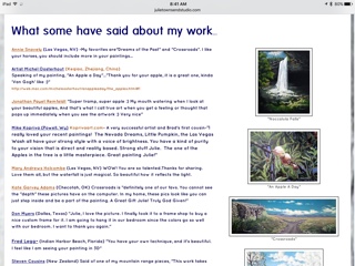
BRAGS AND NEWS- This is the area I have designated to list quotes and comments from previous collectors or art admirers as they have talked about my art or about me as an artist.  If someone is attracted to your artwork it is important that they know they are not alone and that there are many that feel strongly about what you are doing. I also list awards, past and upcoming events that I am participating in.  Some of the information listed is repeated in my resume but this is in a more informal with colorful pictures and larger font.


GALLERY- Probably the most important tab next to Contact Info-  All your artwork showcased online in one area.  By far this is the place that takes the most work.  I am going to dedicate a second and maybe third blog on this topic.   I will try to share all the steps I go through when adding a new piece of artwork to my gallery. It is a bit involved so watch for my future posts on this subject.


Here I will just state that I have my gallery broken into a number of categories to help a visitor perhaps zero in better on what they are specifically looking for in the way of art.  9 categories to be exact.  I know I'm probably excessive and obviously one painting might be present in 2 or 3 galleries but it's not too much work to add them in multiple places and I will  talk about more in future posts.
1.  All My Available Works- "Whole Enchiladas" 
2.  Down Country Roads- My newest collection all in one gallery
3.  Landscape and Western Gallery
4.  Fur and Feathers Gallery
5.  My Sketchbook
6.  Cowbells & Country Store
7.  A Little of This and That
8.  Poems and Other Silly Things (My collection of poetry)
9.  Gone But Not Forgotten (gallery of sold items that are still available in prints)


 JULIE'S ART BLOG- Yes this blog is connected to my website and visa versa.  I spend a great deal of time blogging about my art and I think it is important that I give my website guests a chance to fall in love with my blog and the same for those blog readers.  

CONTACT INFO-  You have to let them contact you via email.  VERY IMPORTANT- you must reply in a timely manner.

SHOPPING CART- Weebly has an interactive store that allows you to sell items just like if you had a brick and mortar gallery.  You just hook up your paypal account, answer a few questions and then start adding products.  I will talk about this more under one of my future blog posts.